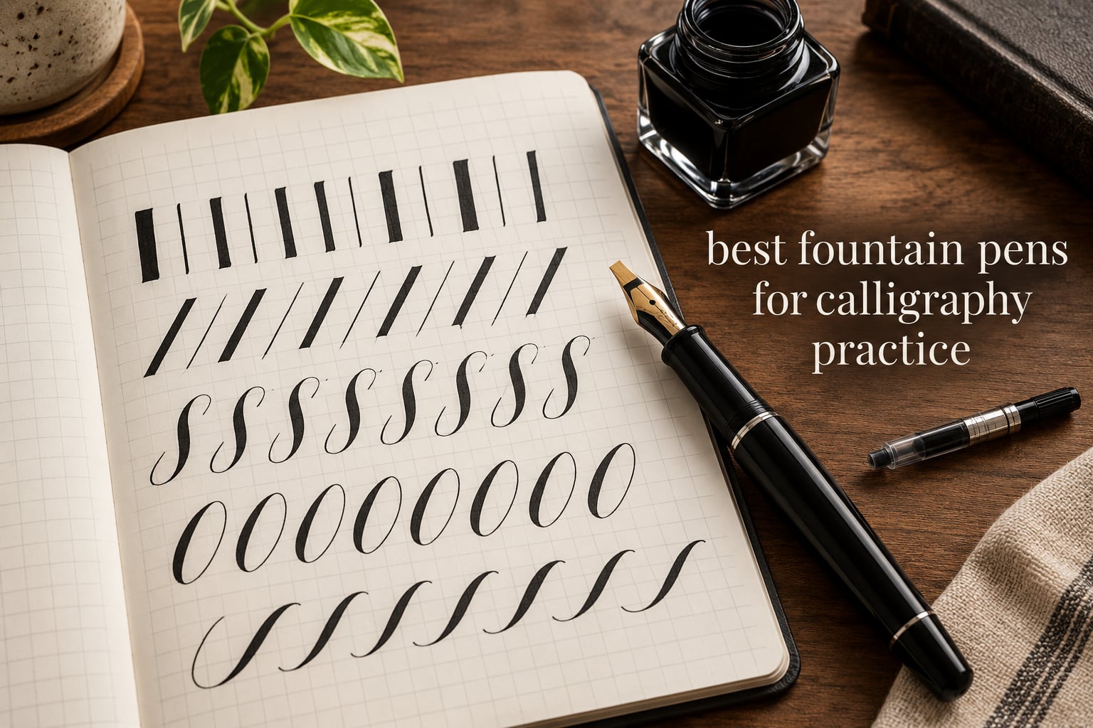
Most people buying a pen for calligraphy make the same mistake. They buy a nice fountain pen, write a page of drills, and quit within a fortnight. The pen was never the problem. The nib was, and the paper was, and the ink was.
That is why we built the best fountain pens for calligraphy practice roundup around practice rather than around prestige. Every pen below was judged on the three things that decide whether a training routine survives: how much line variation the nib actually delivers, whether the ink flow stays controlled across a whole page of drills, and whether your hand stays comfortable after forty minutes of repetitive strokes.
We spent weeks writing with all twelve of these, in the same sessions, on the same paper, swapping nibs and inks between sittings rather than judging each pen on a single good line. What follows is what held up and what did not.
A word on disclosure: the links in this guide are affiliate links, so we may earn a commission if you buy through them. That does not change how we ranked anything. The order you see is the order we would hand to a friend who asked us to pick one pen for them.
Table of Contents
Top 3 Picks for Best Fountain Pens for Calligraphy Practice in October
If you only read one section, read this one. The Pilot Parallel is the pen we kept reaching for, the Lamy joy set is the one that felt the most finished in the hand, and the Sailor Fude is the cheapest route into a completely different kind of line.

PILOT Parallel 3.8mm Set
- Parallel plate nib
- Rotating pen changes line width
- Four nib widths available


Best Fountain Pens for Calligraphy Practice in 2026
| Product | Specifications | Action |
|---|---|---|
| PILOT Parallel 3.8mm Set |
|
Check Latest Price |
| Sailor Fude De Mannen |
|
Check Latest Price |
 Asvine Forest Fude Asvine Forest Fude |
|
Check Latest Price |
| Lamy joy Calligraphy Set |
|
Check Latest Price |
 GC QUILL 7-Pen Set GC QUILL 7-Pen Set |
|
Check Latest Price |
 Asvine P20 Stub 1.1mm Asvine P20 Stub 1.1mm |
|
Check Latest Price |
 Wordsworth and Black 6-Nib Set Wordsworth and Black 6-Nib Set |
|
Check Latest Price |
 Wonwood 7-Piece Set Wonwood 7-Piece Set |
|
Check Latest Price |
 Speedball 1.5mm Pen Speedball 1.5mm Pen |
|
Check Latest Price |
 Jinhao 159 Bent Nib Jinhao 159 Bent Nib |
|
Check Latest Price |
 Wordsworth and Black Erudite Wordsworth and Black Erudite |
|
Check Latest Price |
 TIANREN 8-Nib Set TIANREN 8-Nib Set |
|
Check Latest Price |
1. PILOT Parallel 3.8mm Calligraphy Pen Set – Best Overall Starter
PILOT Parallel Calligraphy Pen Set, 3.8mm Nib with Black and Red Ink Cartridges (90052)
3.8mm parallel plate nib
Refillable body, cartridges included
Light 9.07g plastic barrel
Pros
- Flat edge gives crisp thick and thin strokes
- Four nib widths so you can match your script
- Light body keeps the hand relaxed over long sessions
- Reliable flow straight out of the box
Cons
- High flow rate feathers on absorbent paper
- Nib corners can catch and spatter on backstrokes
- Wide nibs use ink quickly
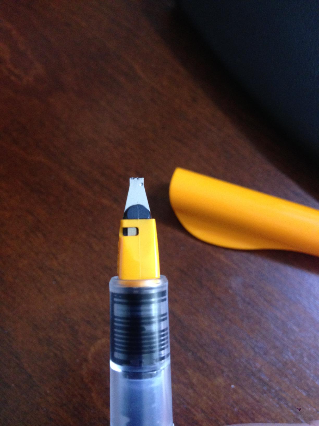
The Parallel is the pen we kept coming back to during testing, and it earns the top slot here because it makes thick-and-thin contrast almost impossible to get wrong. Two flat steel plates sit parallel to each other, so the edge facing your writing direction is the edge that does the work.
Rotate the pen a little and the thick stroke narrows to a hairline. Rotate it back and you are drawing a broad downstroke. That single mechanical fact is what separates a real calligraphy pen from a monoline fountain pen, and the Parallel delivers it on the first try with no learning curve at all.
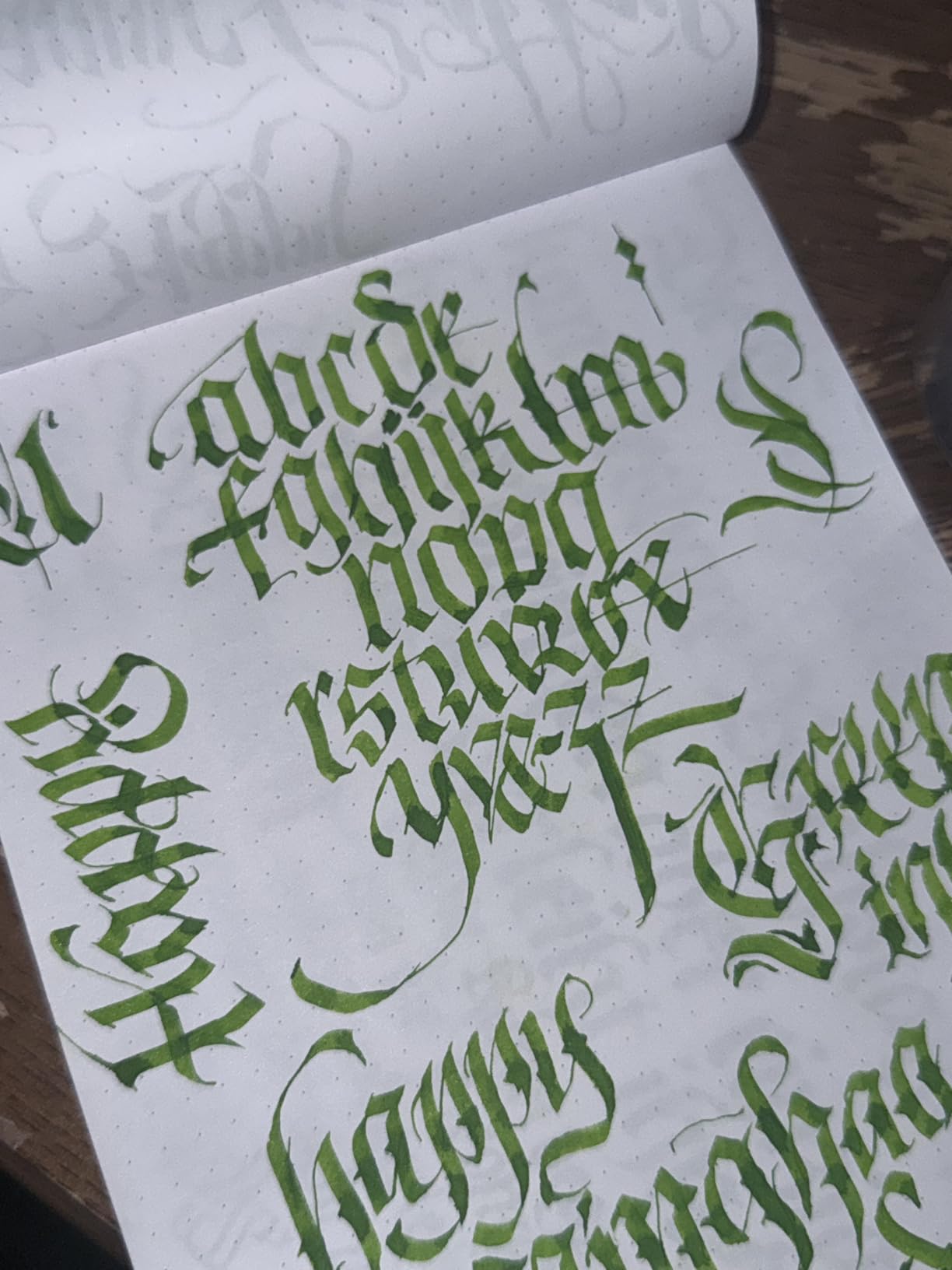
The 3.8mm version in this set is the sweet spot for beginners. It is wide enough to see your strokes clearly and judge your spacing, and narrow enough that a shaky outline letter still looks intentional. We drilled with it for weeks without the nib corner catching, which is the usual complaint about flat nibs.
What caught us out was ink. The flow rate is generous, and on cheap copy paper the line feathers into a soft blob within seconds. On proper fountain pen friendly paper it behaves perfectly, which is why our paper section matters as much as our pen section.
How it handles a full practice session
A cartridge lasts about twenty minutes of continuous drill work before you notice it fading, and the refill process takes seconds. Because the body takes cartridges or an eyedropper fill, you can move to bottled ink once you outgrow the supplied colours.
The barrel weighs 9.07g, which is genuinely light. That is an underrated feature when you are writing basic strokes for forty minutes and your wrist is under the table rather than above it.
Where it falls short
Backstrokes are the weak point. The sharp corners of the plate nib catch on paper when you pull the pen backwards, and a determined nib spatter can fling a small drop of ink. Slow down and lift instead of dragging.
It is also a plastic pen that looks like a plastic pen. Nobody will be impressed by it, which is fine, because it is the pen that quietly made our hands better.
2. Sailor Fude De Mannen Bamboo Green – Best for Brush-Style Lettering
Sailor Fude De Mannen – Stroke Style Calligraphy Fountain Pen – Bamboo Green – Nib Angle 55 Degrees (11-0127-767)
55 degree bent fude nib
0.5mm fine line size
9.07g, 9.4 inch capped length
Pros
- Bent nib gives strong quick line variation
- Broad strokes dry fast without pooling
- Long barrel helps with hatching and free strokes
- No hard starts from the cartridge
Cons
- Bent nib angle has a steep learning curve
- Very light in the hand
- Cartridge can twist loose at the base
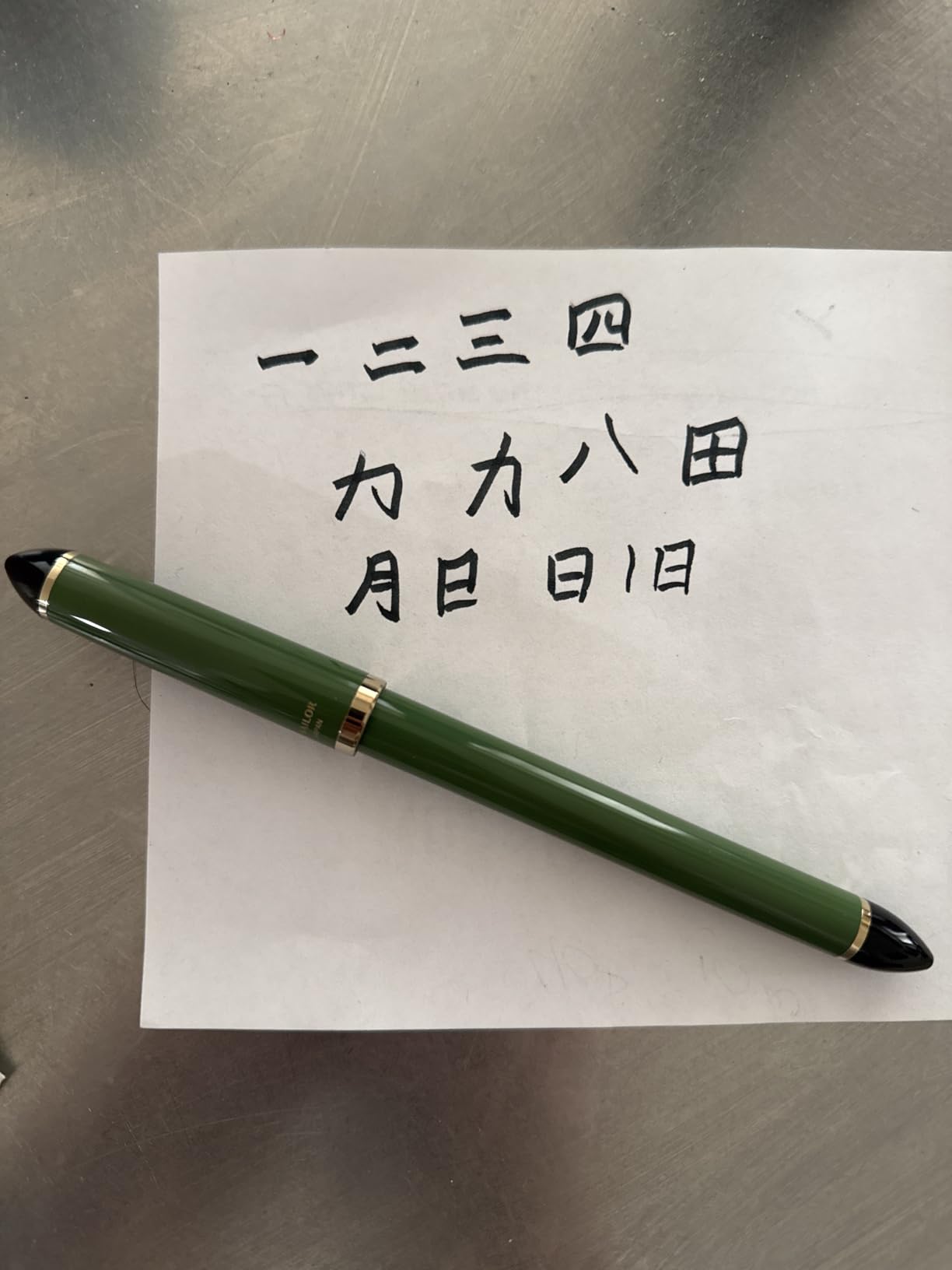
The Sailor Fude is a completely different machine from the Parallel. Instead of a flat edge, it has a nib bent to a 55 degree angle, the same basic idea as a brush pen, and you change line width by changing how you hold it.
That makes it the most expressive pen in this guide and the least precise. Broad strokes land as a thin even film of ink that dries fast, with no pooling at the edges, which is exactly what hand lettering and sign painting need.
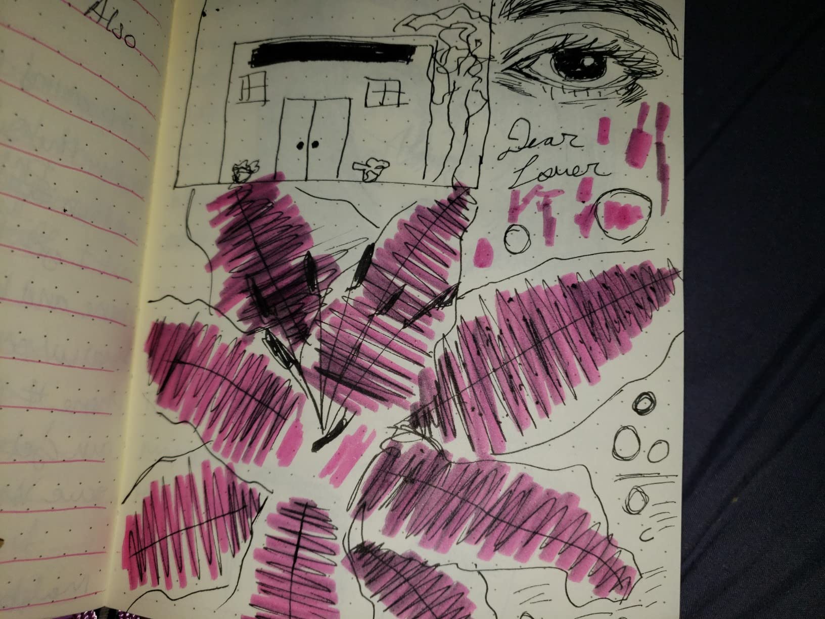
The long barrel is not decoration. It gives you real distance between your hand and the nib, which makes free sketching strokes and extended hatching possible without smearing. No other pen in this roundup does that as naturally.
We used it for lettering drills and rough layout sketches in the same session, and both worked. Just do not expect parallel edges. A fude nib is for expressive weight, not for crisp formal scripts.
Who this suits
Writers who came to calligraphy from hand lettering, brush lettering or sketching will feel at home immediately. If you want strokes that swell and taper like ink brushwork rather than crisp contrast from a fixed edge, this is your pen.
It also takes an international standard converter, so you are not locked into the supplied cartridge once you want to choose your own ink.
Who should skip it
If you are practising formal italic or blackletter, the bent nib is working against you. It cannot give you the clean squared contrast that defines those scripts.
It is also light enough that some writers find it unsteady, and underhand writers will struggle with the angle. The cartridge fitting has also drawn complaints about loosening at the base.
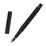
3. Asvine Forest Fude Metal Pen – Best Bent Nib in a Metal Body
Brushed Black Forest Fude Pen, Bent Nib Calligraphy Fountain Pen (Fine to Broad) with Converter and Metal Box Set by Asvine
Curved fude nib, 1mm line size
31g balanced metal body
Converter and metal case included
Pros
- Bent nib makes fine to broad variation easy
- Weight is balanced for long writing sessions
- Converter included for any bottled ink
- Matte finish resists fingerprints
Cons
- Matte coating scratches easily in a pocket
- Heavier than entry-level plastic pens
- Some nibs start hard if not primed
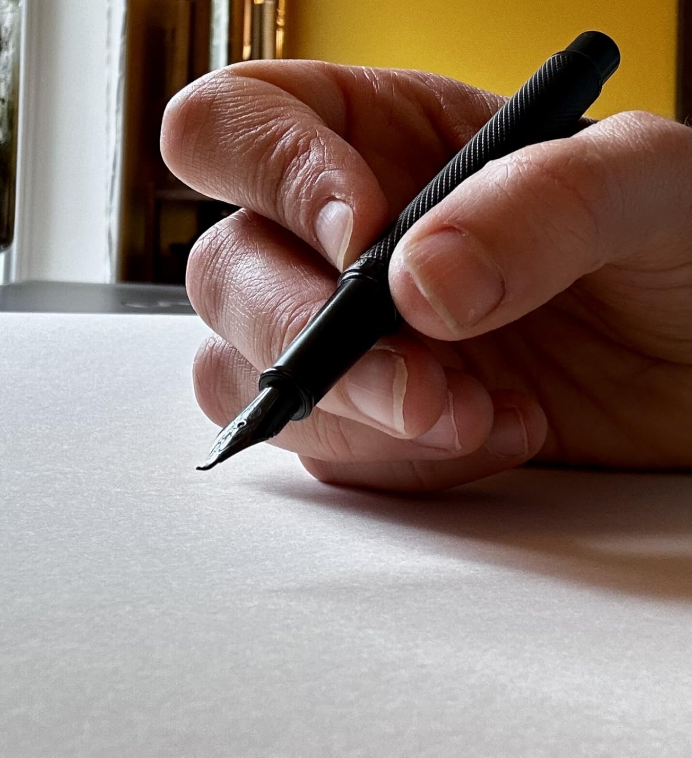
Where the Sailor is light bamboo, the Asvine Forest is a 31g matte metal pen, and that difference changes how the fude nib behaves. The added mass damps the bounce out of your strokes, so line weight changes feel more deliberate.
The nib is described by owners as a curved fude that also reads like an italic, and in practice we got a genuine spread from hairline to broad without the railroading that plagues some bent nibs. It is a good middle ground between expressive and controlled.
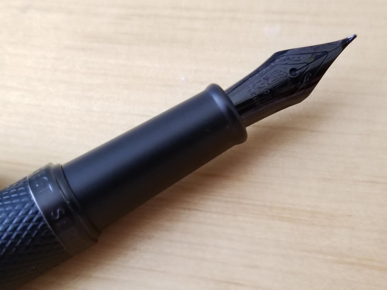
The nib and feed unscrew from the section, which makes cleaning and swapping straightforward. That matters more than it sounds for a pen you will use daily, because ink residue sets in a feed fast.
A converter and a metal case come in the box, so this is a complete setup rather than a bare pen. Our one persistent note is that the matte coating marks easily, so keep it in the case between sessions.
What it is good at
Sketching with a fountain pen, casual hand lettering and long unhurried writing sessions. The balanced weight means it disappears in the hand after about five minutes.
It is also a strong first metal-bodied pen. Writers moving up from plastic notice the difference in feed consistency immediately.
What to watch
A slightly slippery grip section catches some reviewers out during long sessions, and a few nibs need priming before they start flowing cleanly. Ink is not included, so plan for that before your first sitting.
4. Lamy joy Calligraphy Set – Premium Pick
Lamy joy black calligraphy fountain pen set – fountain pen with 3 different nibs (1.1/1.5/1.9 mm) – calligraphy pen with ribbon nib & ergonomic grip – incl. 5 T 10 blue ink cartridges
Three ribbon nibs at 1.1/1.5/1.9mm
Each nib has its own section and feed
Ergonomic grip with barrel ink window
Pros
- Three nib widths in one set with separate sections
- Crisp reliable thick and thin ratio
- Shaped grip supports long fatigue-free practice
- Durable ASA plastic body with ink window
Cons
- Long barrel will not fit many pen cases
- Only accepts Lamy T 10 cartridges and Z 28 converters
- Glossy finish shows scratches
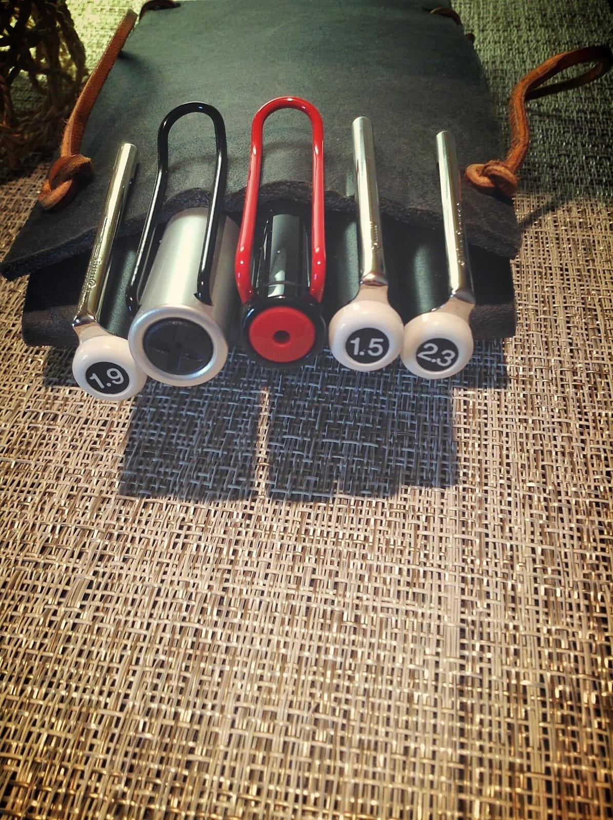
The Lamy joy set is the most considered piece of design here, and it is the only pen in the roundup that ships three genuinely different nibs, each with its own grip section and feed rather than a single swappable unit.
Those three widths, 1.1mm, 1.5mm and 1.9mm, are the real story. A single nib forces you to learn one thick-stroke width; three nibs let you practise the same letterforms at three scales in one sitting, which is how you build control.
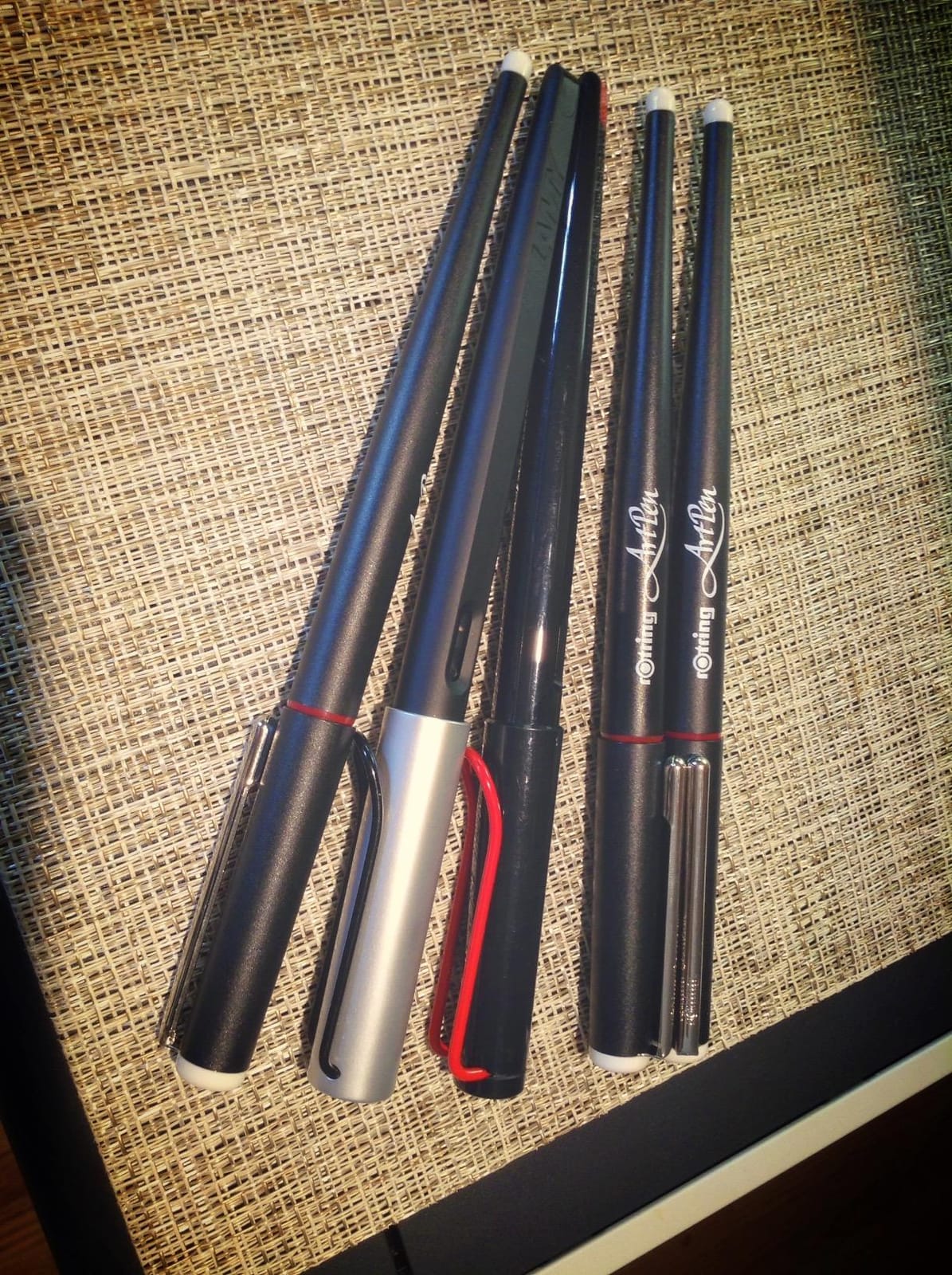
The thick and thin ratio is crisp and consistent, and the nibs wrote smoothly on almost every paper we tried. The shaped grip section is the feature we would single out for practice specifically, because it supports the tripod hold that formal scripts need.
No finger staining, a clean cap fit and a barrel window that shows remaining ink. In daily use it behaved like a tool rather than a novelty.
Where it earns its place
For a writer who has already decided to practise formal scripts, the three nib sizes plus the ergonomics are worth more than any single-nib alternative. The grip is the quiet hero for long sessions.
If you are torn between italic and stub, this set lets you test both styles without a second purchase.
What it costs you
The barrel is long and will not fit most pen cases, so it lives on a desk rather than in a bag. The ink system is proprietary, meaning cartridges and converters have to come from Lamy.
And the glossy plastic finish scuffs. None of that touches the writing, but it is the reason this sits at four rather than one.
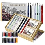
5. GC QUILL Seven-Pen Calligraphy Set – Best Gift Starter Kit
GC QUILL Calligraphy Fountain Pen Set- 7 with Different Nibs and 40 Ink Cartridges for Beginners- MU-09
Seven pens, six nib sizes and a brush nib
40 cartridges across 14 colors
Converter included with every pen
Pros
- Seven nib sizes plus a brush nib in one box
- 40 cartridges mean you can practise immediately
- Contoured grip supports longer sessions
- Ready-made beginner gift presentation
Cons
- Quality varies
- some pens arrive not flowing
- Some nibs produce uneven lines
- Water-based cartridges may need pressing to flow
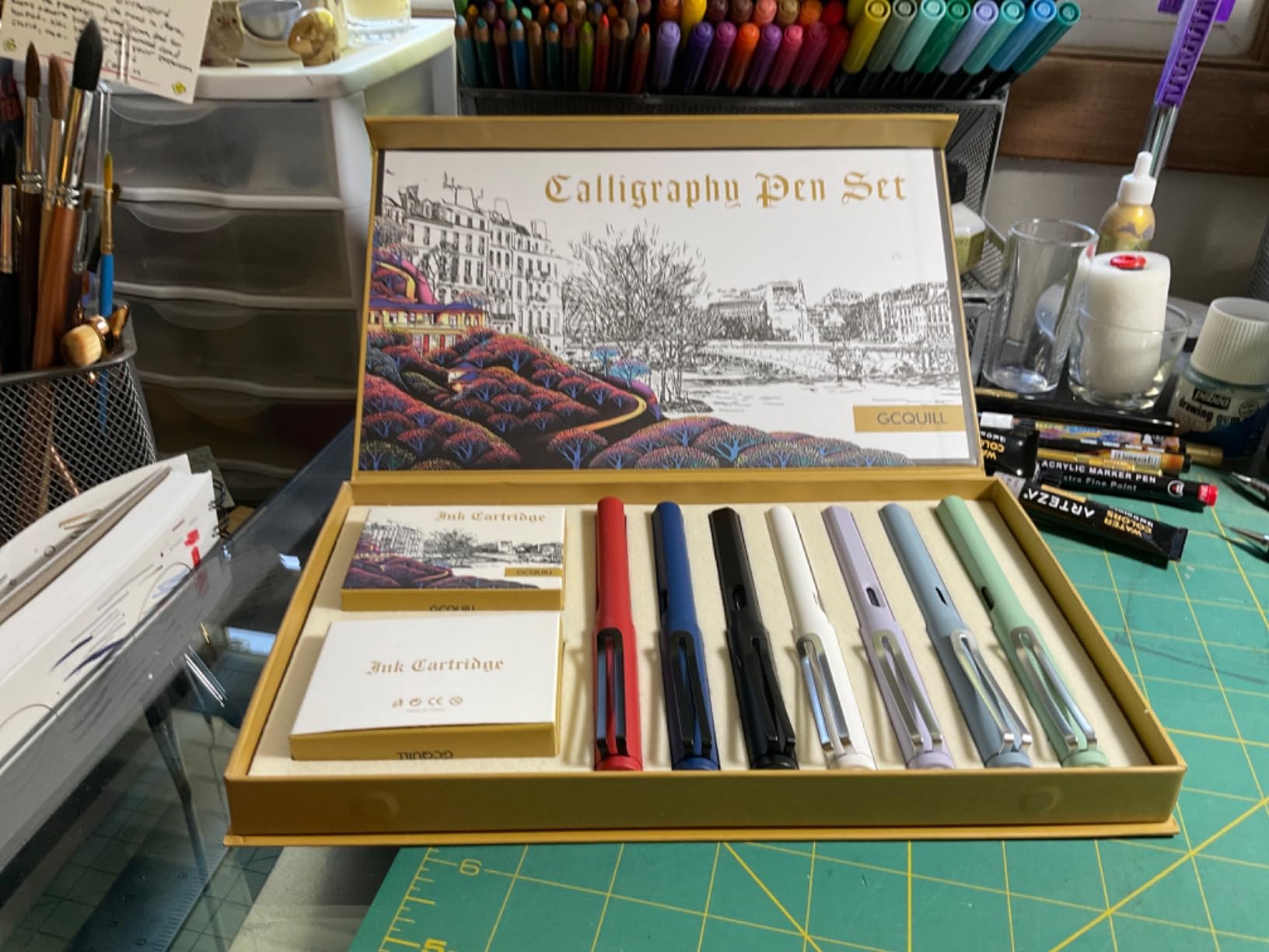
This set answers a question the rest of the roundup cannot: which nib style do you actually like? Seven pens, six nib widths and a brush nib means you can spend a month writing with each one before committing to anything.
That trial period is genuinely valuable. Beginners routinely buy a single-nib pen, discover the line is too thin for the script they had in mind, and give up.
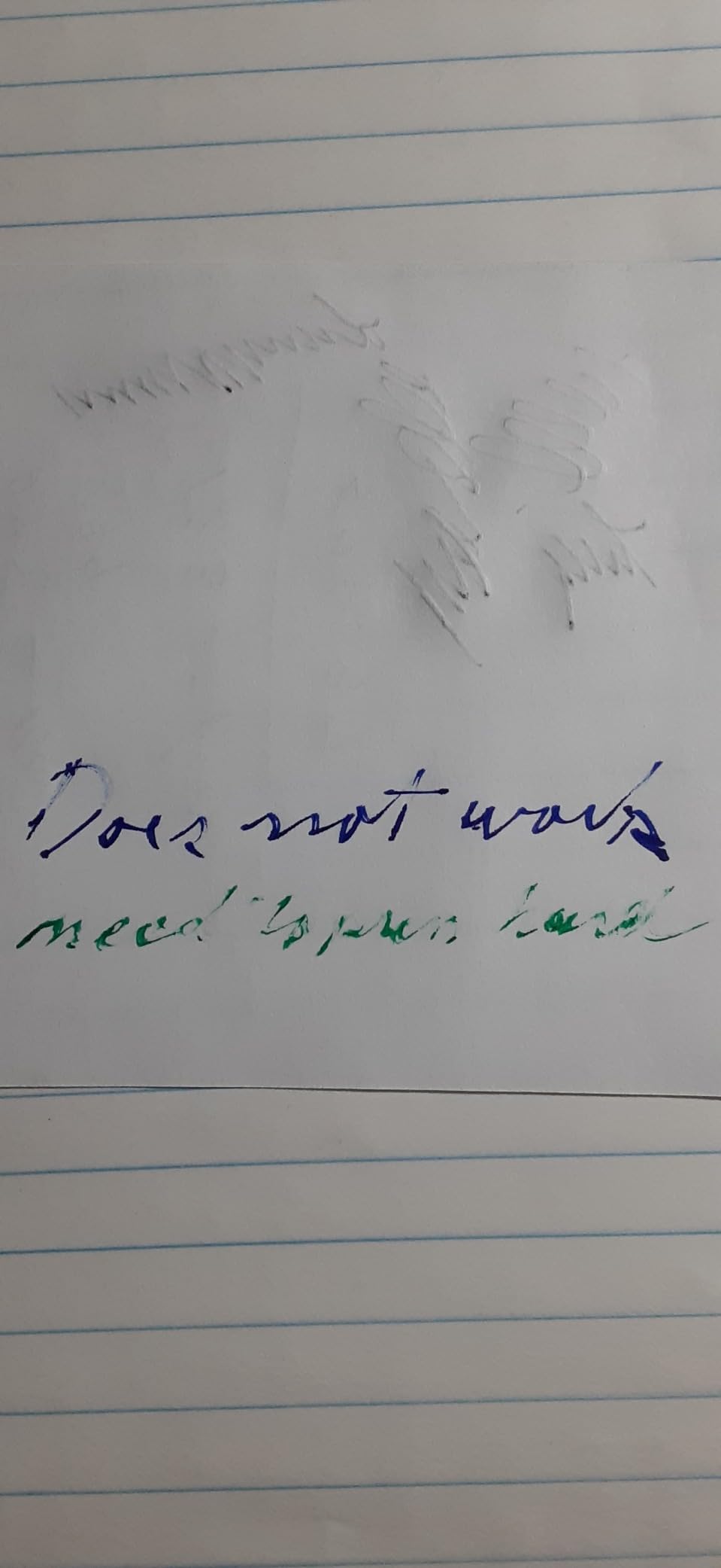
Each pen includes its own converter, so bottled ink is available from day one rather than after a separate purchase. Forty cartridges in fourteen colours also make it a good gift for a child or a beginner.
The contoured grip is comfortable enough for a session, though it is not a tripod-specific shape.
Who it suits
Anyone still deciding between nib families. It is also a low-risk way to introduce a younger writer to fountain pens, since a single dud pen is not a disaster.
Colour variety matters more here than it sounds, because practising letterforms with two inks teaches you about ink behaviour as well as stroke control.
Where it disappoints
Consistency is the weak point. Owners report a share of pens arriving with weak or dead flow, and some nibs laying down crooked lines. We advise testing every pen in the box before you commit to one.
The included directions also skip the internal spring component, so expect a short learning curve on filling.
6. Asvine P20 Piston Stub 1.1mm – Best for Long Practice Sessions
Asvine P20 Piston Fountain Pen, Stub Nib 1.1mm Calligraphy Art Drawing Amber Acrylic with Case Set
1.1mm stub nib tuned for lettering
28.3g acrylic body with piston fill
Transparent ink window
Pros
- Stub nib writes smoothly with even flow
- Piston fill holds far more ink than a cartridge
- Acrylic body has no molding seams
- Ergonomic no-slip section for long writing
Cons
- Flow is sensitive to ink choice
- Cap does not always seal airtight
- Ink window ring edge can dig into fingers
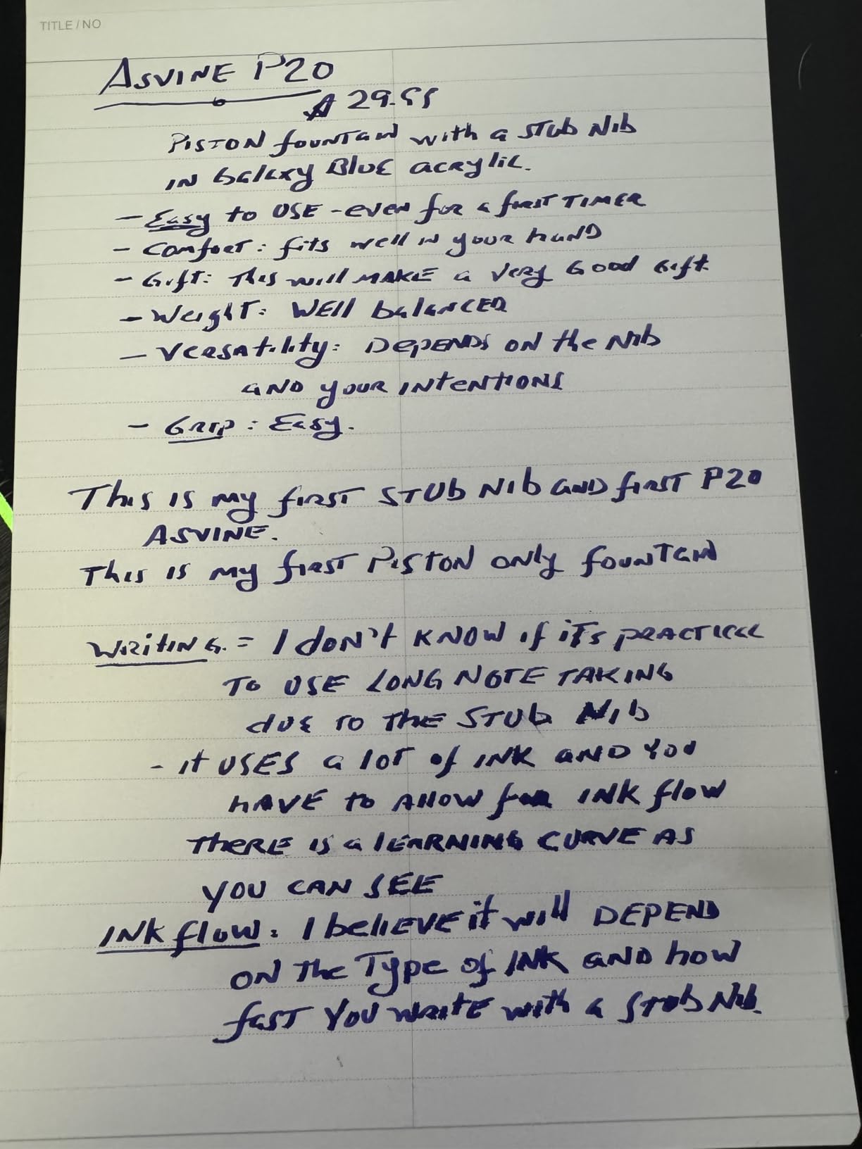
The P20 solves a problem most practice pens create: the refill. A piston filling system holds far more ink than a cartridge or a small converter, which in practice means you fill once and drill for weeks.
The 1.1mm stub nib is tuned for signatures and lettering, and it wrote with notably even flow in our tests. A stub is more rounded and forgiving than an italic, with less extreme contrast, which makes it a good first serious nib.
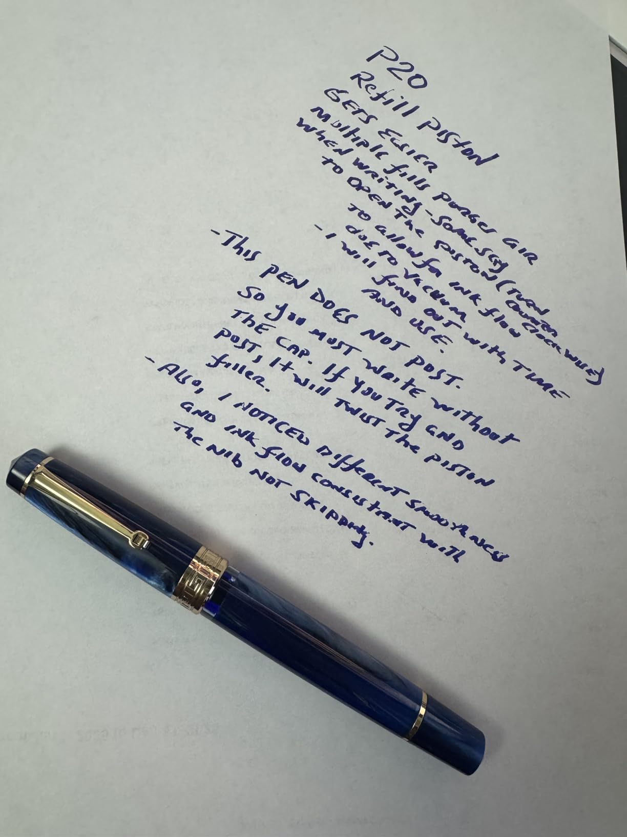
The turned acrylic body has real visual sparkle and translucency, and the transparent window means you can see ink level at a glance instead of guessing. The no-slip grip section stayed comfortable through long sessions.
Because the barrel is 15mm across, it works well as a tripod grip pen and gives underhand writers more room than a slim plastic body.
Where it fits
Writers who practise daily rather than occasionally. Ink capacity is the quiet advantage that pays off across months, and the 1.1mm stub is a forgiving way to learn downstroke weight.
It is also a solid pen to take to a workshop or a class, where a cartridge pen would run dry halfway through.
What to know before you buy
Flow depends on your ink choice more than most fountain pens. Test it with the ink you intend to use, because thin or fast-drying inks can write dry and scratchy.
A minority of examples arrive with a misaligned nib or a blocked feed, and caps that do not seal fully let ink dry faster than expected.
7. Wordsworth and Black Six-Nib Calligraphy Set – Best All-in-One Set
Wordsworth & Black Luxury Calligraphy Pen Set for Writing, 6 Nibs, Black
Six replacement nibs, round and chisel
Ink bottle and converter included
37g contoured grip metal body
Pros
- Six spare nibs cover many script types
- Nibs hold ink without leaking or staining
- Converter fits securely for bottled ink
- Instruction booklet covers basic strokes
Cons
- Presentation box is easily crushed in the post
- Occasionally one nib in the set performs poorly
- Best results with the branded cartridges
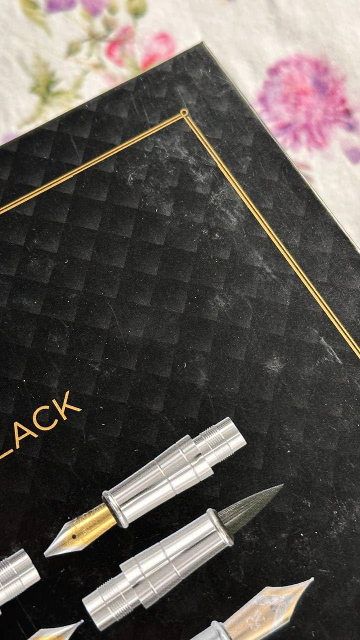
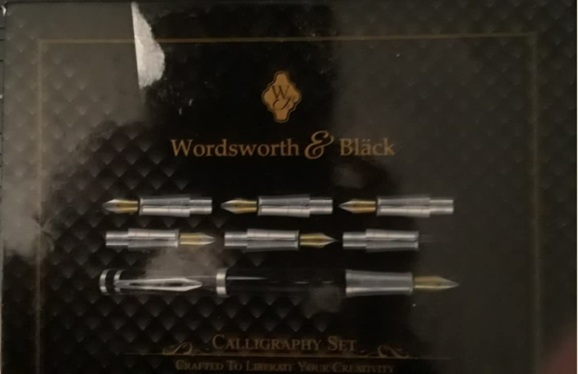
This is the set we would hand to someone who wants one box to contain everything. Six replacement nibs, an ink bottle, a converter and cartridges, all inside a single package with instructions.
The nibs cover both round and chisel styles, which means you can move from monoline practice into flex behaviour without buying a second pen. Long-time calligraphers in the reviews single this set out as unusually good for the money.
Flow was smooth and streak-free in our testing, and nothing stained our fingers, which is a small thing that matters a great deal during long drills. The converter also seats properly, unlike several cheaper sets.
Worked consistently for both right- and left-handed writers in the reviews, with no leakage reported from the cap.
Why the instruction booklet matters
For a beginner, a booklet covering basic stroke technique turns the pen into a usable training tool instead of a puzzle. The strokes you practise first should be the ones a manual would have you draw.
It also reduces the chance of holding the pen wrongly in the first place, which is the habit most expensive to unlearn.
What could be better
The presentation box is the weak link. It arrives dented or scuffed often enough that we would not trust it to protect the pen in a bag, so keep the pen in a sleeve instead.
Occasionally one nib in the set underperforms, and results are best with the matching cartridges rather than bottled ink.
8. Wonwood Seven-Piece Calligraphy Set – Best for Sampling Nib Sizes
Calligraphy Set, 7 Pcs Fountain Pen with Different Replaceable Nib and 40 Replaceable Ink Cartridge in 11 Color for Beginner Writing and Drawing Calligraphy Kit
Seven nib widths from 0.5mm to 2.9mm
Stainless steel nibs, triangular grip
Barrel ink window on every pen
Pros
- Seven nib widths stamped on each nib
- Transparent barrels show ink level
- Grooved triangular grip teaches a correct hold
- Converters included for bottled ink
Cons
- Cartridges are hard to seat
- Some sets arrive with bent nibs
- Some ink colours skip and starve the feed
The Wonwood set covers the widest nib range of anything we tested, from 0.5mm up to 2.9mm across seven pens, with the size stamped on each nib. That stamping alone makes it more useful for learning than an unlabelled set.
The triangular grip is grooved to teach a correct fountain pen hold, which is exactly the habit beginners need to build early. Transparent barrels mean you can see the ink level and handle the pen more carefully at the same time.
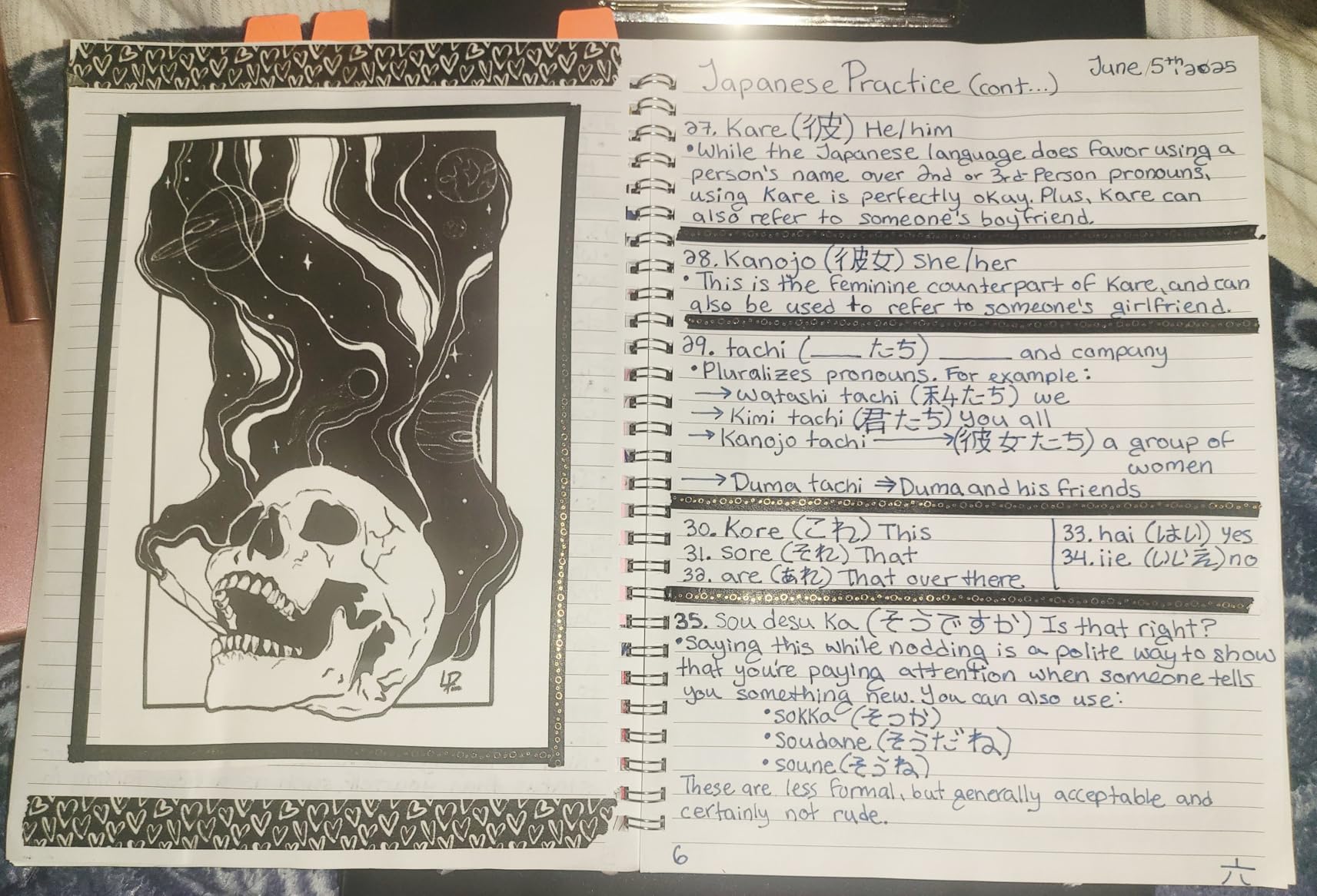
Nibs are interchangeable and reportedly fit a Pilot Kakuno as well, so the set doubles as a nib source for a pen you may already own. That is a genuinely useful trick for practice sessions.
Forty cartridges in eleven colours and six converters round out a package that needs nothing else to get started.
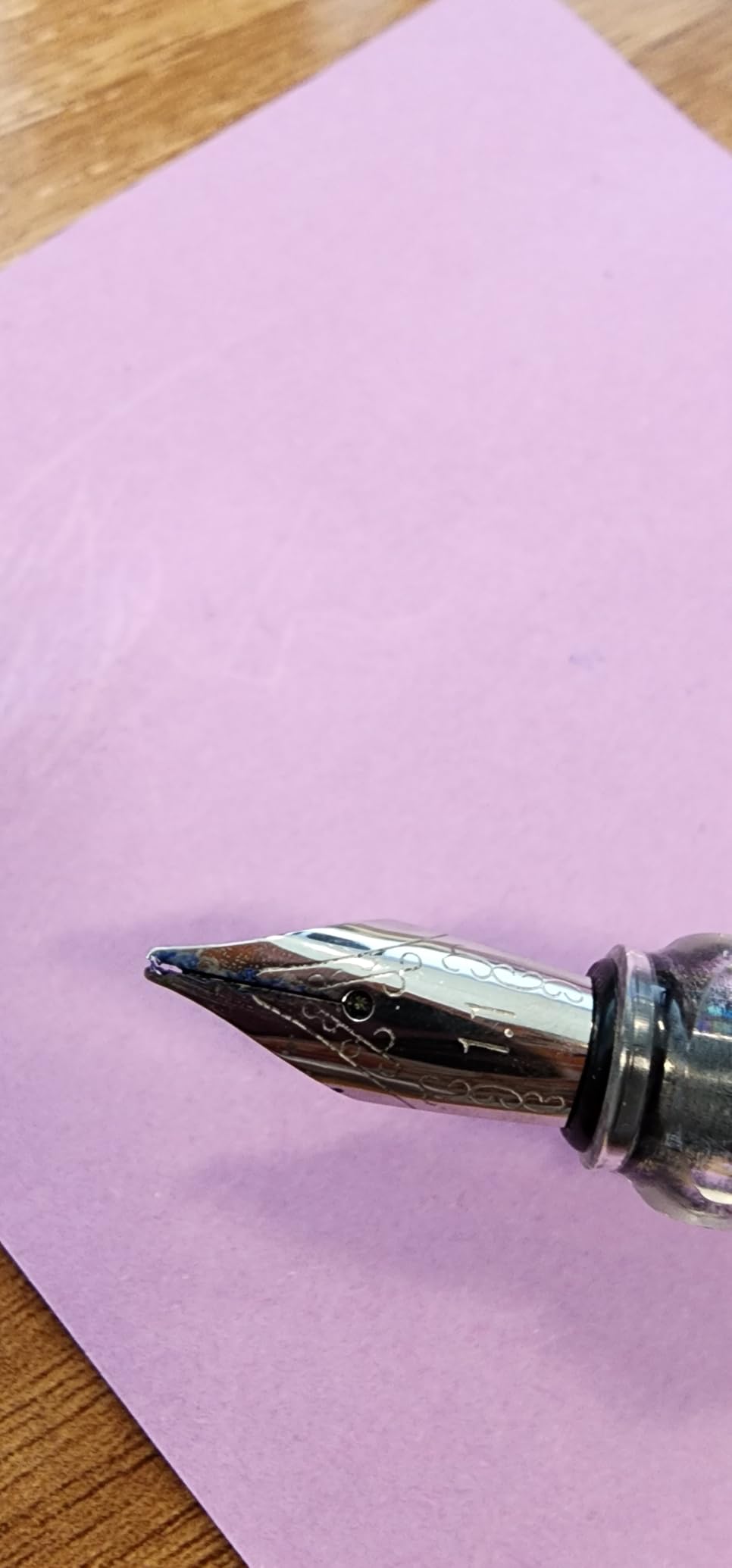
Best used as a sampling tool
Spend a week with each nib width and note which produces the letterforms you actually want to draw. Then buy one quality pen at your chosen width rather than seven mediocre ones.
For a household with more than one beginner, the set is inexpensive shared practice equipment.
What frustrated us
The cartridges take firm pressure to click into place, and getting that wrong leaves a pen that looks full and writes dry. Budget a minute per pen the first time you fill them.
A few sets arrive with bent nibs, and light inks such as red can skip on the feed. Check every nib on paper before you start a session.
9. Speedball 1.5mm Calligraphy Fountain Pen – Budget Pick
Speedball Art Products 002901 Calligraphy Fountain Pen 1.5mm
1.5mm machined stub nib
Lightweight ergonomic plastic body
Two black cartridges included
Pros
- Machined nib delivers crisp thick and thin lines
- Lightweight body with free-flowing ink
- Cheapest reliable way to test calligraphy
- Handles formal lettering without drips
Cons
- Rounded nib gives less contrast than a true italic
- Ink can run on ordinary paper
- Small cartridges run out quickly
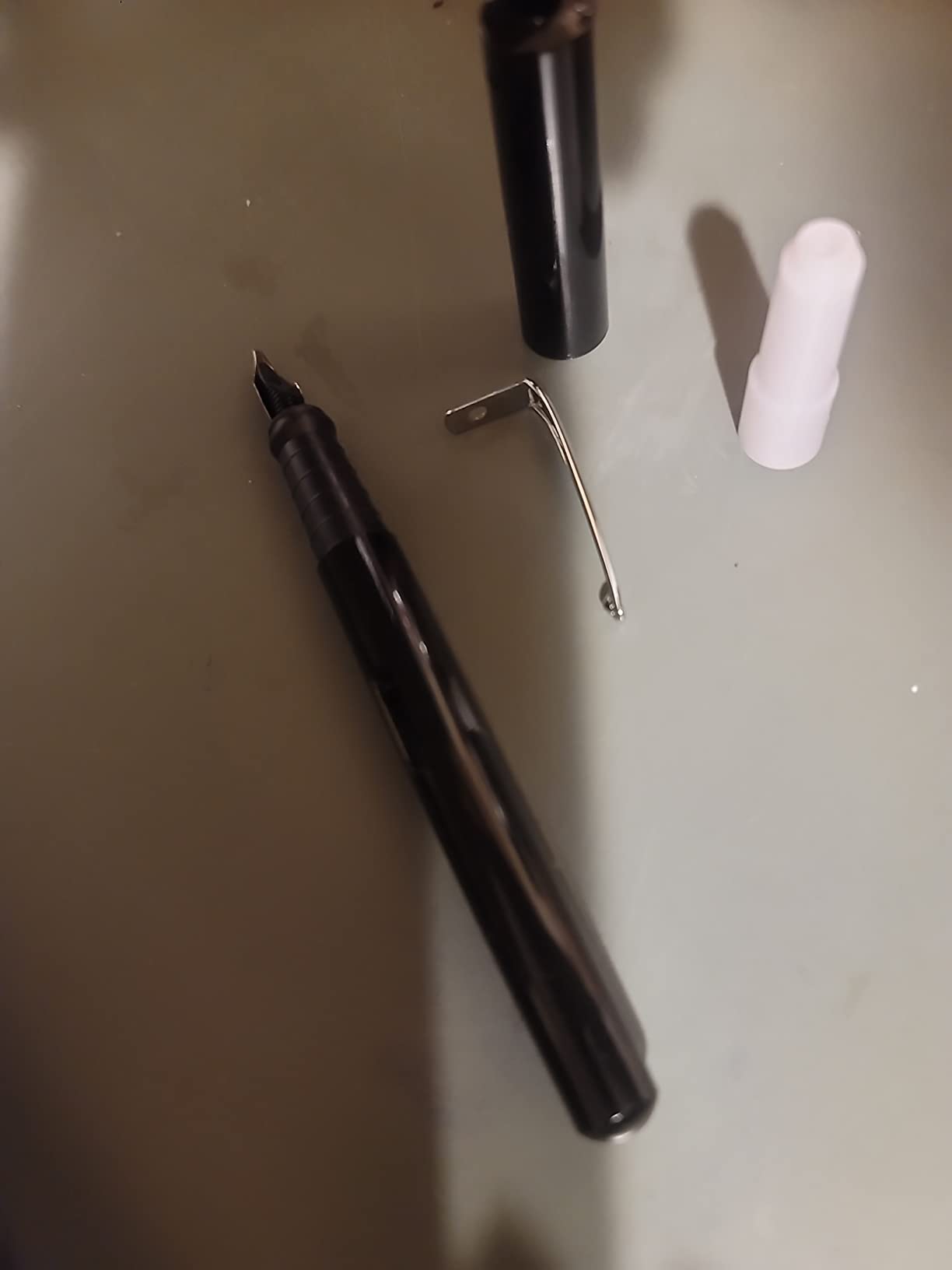
The Speedball is the cheapest credible way to find out whether calligraphy suits you. It is a straightforward 1.5mm stub fountain pen with a precisely machined, slightly rounded nib and a body light enough that hand fatigue is a non-issue.
It writes crisp thick and thin lines and handled formal lettering without the drips or splotches that plague cheaper pens. If you are undecided, this is the smallest possible commitment.
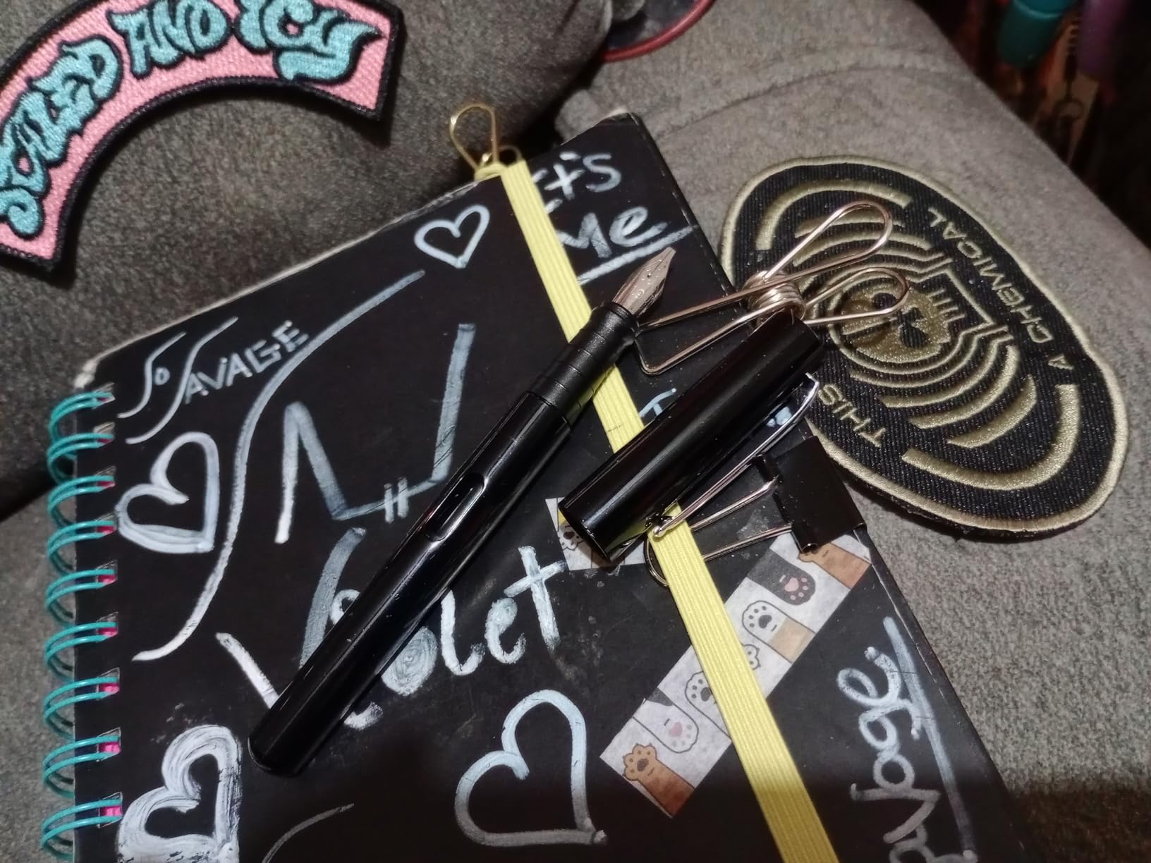
The same pen is made in 1.1mm and 1.9mm, so if 1.5mm proves wrong for your script you have not wasted the experiment entirely.
Ink flow is free and consistent, which on good paper means you can think about letterforms instead of about the pen.
Why it is worth starting here
Two cartridges are included and the body is refillable, so there is no accessory to buy before your first drill. For a nervous beginner, that zero-friction start is worth more than a better nib.
It also makes a good travel or practice-loan pen that will not be missed if it gets lost.
What it will not teach you
The rounded tip is a stub rather than an italic, so line contrast is softer and less dramatic. If formal italic with crisp squared contrast is your goal, move up to a true italic nib later.
On ordinary paper the ink runs. Use proper fountain pen friendly sheets or your practice will look worse than your skill.
10. Jinhao 159 Purple Lacquer Bent Nib – Best for Writers Who Like a Heavy Pen
Jinhao 159 Fountain Pen, Fude Pen Bent Nib, Purple Lacquer Silver Trim Big Heavy Pen with and Ink Converter
Bent fude nib, 0.3 to 1.2mm line size
50g lacquer metal body, 148mm capped
Converter and storage case included
Pros
- Bent nib varies line weight by angle alone
- Glossy lacquer finish feels well made
- Fude nib resists railroading
- Standard nib fit makes swapping easy
Cons
- Large and heavy over long sessions
- Writes wet and can bleed through paper
- Cap does not post reliably
- No cartridge included
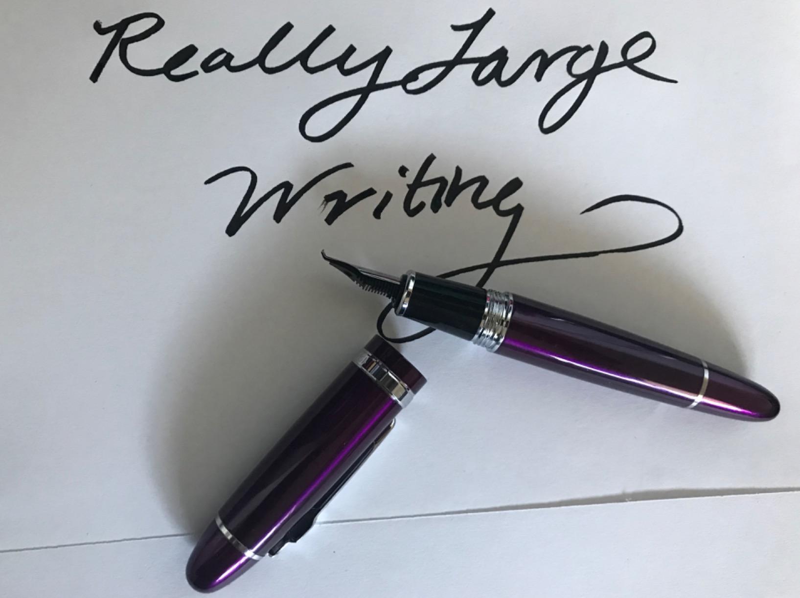
The Jinhao 159 is unapologetically big. At 148mm capped and 50g, with a 17mm barrel, it is a completely different object from the 9g plastic practice pens, and some writers find that solidity is exactly what they want.
The bent fude nib produces a wide range of line weights purely through angle, and owners report it is less prone to railroading than some bent nibs, which is the failure mode that wrecks pointed-pen work.
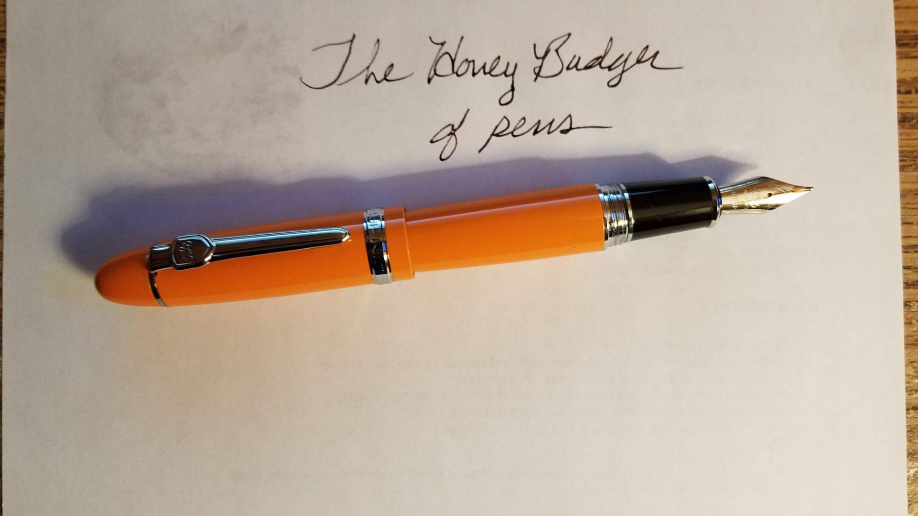
The purple lacquer and silver trim look far more expensive than the pen is, and the standard nib fit means you can change the nib later for more options as your skill grows.
A converter and storage case are included, though you will need to buy ink separately.
Where the weight helps
Heavier barrels steady the hand and reduce the bounce you get at the end of a downstroke. If your thin strokes wobble because your hand is tense, the extra mass makes that harder to do.
It is a good pen for signing practice, sketching and casual lettering work where expressiveness matters more than edge crispness.
Where the weight hurts
Over a long session it becomes tiring, and it is not a pen to practise basic strokes in for an hour. It also writes quite wet, so on standard notebook paper you will see bleed-through.
The cap does not post reliably and the lacquer chips with use, so store it in the case and do not post the cap upside down on the desk.
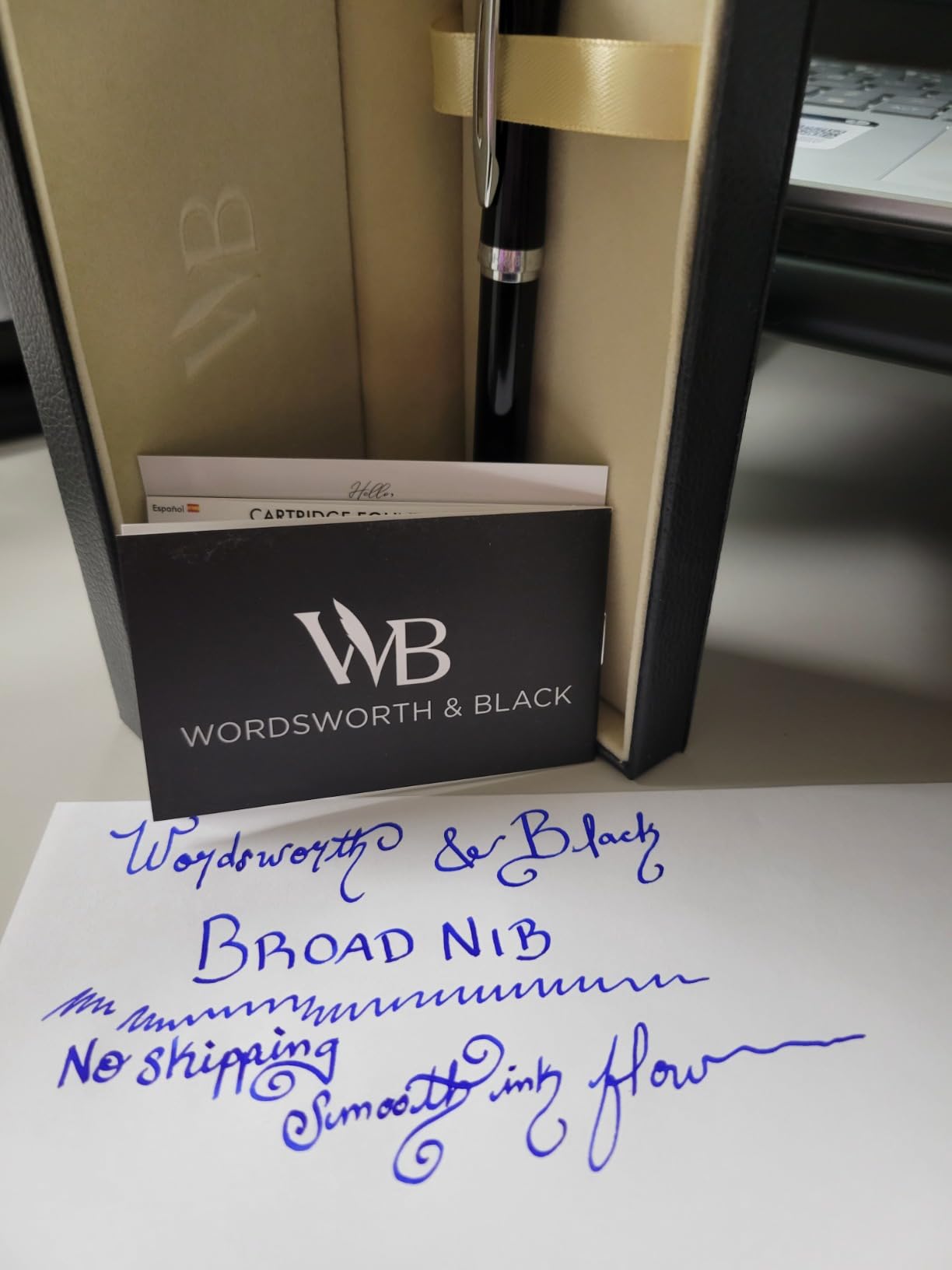
11. Wordsworth and Black Erudite Broad Nib – Best for Bold Lettering
Wordsworth & Black Luxury Fountain Pen Set for Writing, Broad Nib, Black
Broad nib around 1mm line width
Weighted metal body with contoured grip
24 cartridges plus a converter included
Pros
- Broad nib lays down a smooth bold line
- Well balanced metal body feels premium
- Cap posts securely and seals well
- Customer service replaces flow problems quickly
Cons
- Broad nib uses ink quickly
- Nib is closer to a 1.0mm stub than a wide italic
- Some examples skip at the start of lines
The Erudite is built around one idea: make the thick stroke look deliberate. Its broad nib lays down a smooth, bold line that makes lettering stand out on a page, and the weighted metal body gives it a premium feel that most practice pens lack.
Reviewers who found the line width narrower than the broad label suggested upgraded to the medium nib, so treat this as a bold stub rather than a wide italic and set your expectations accordingly.
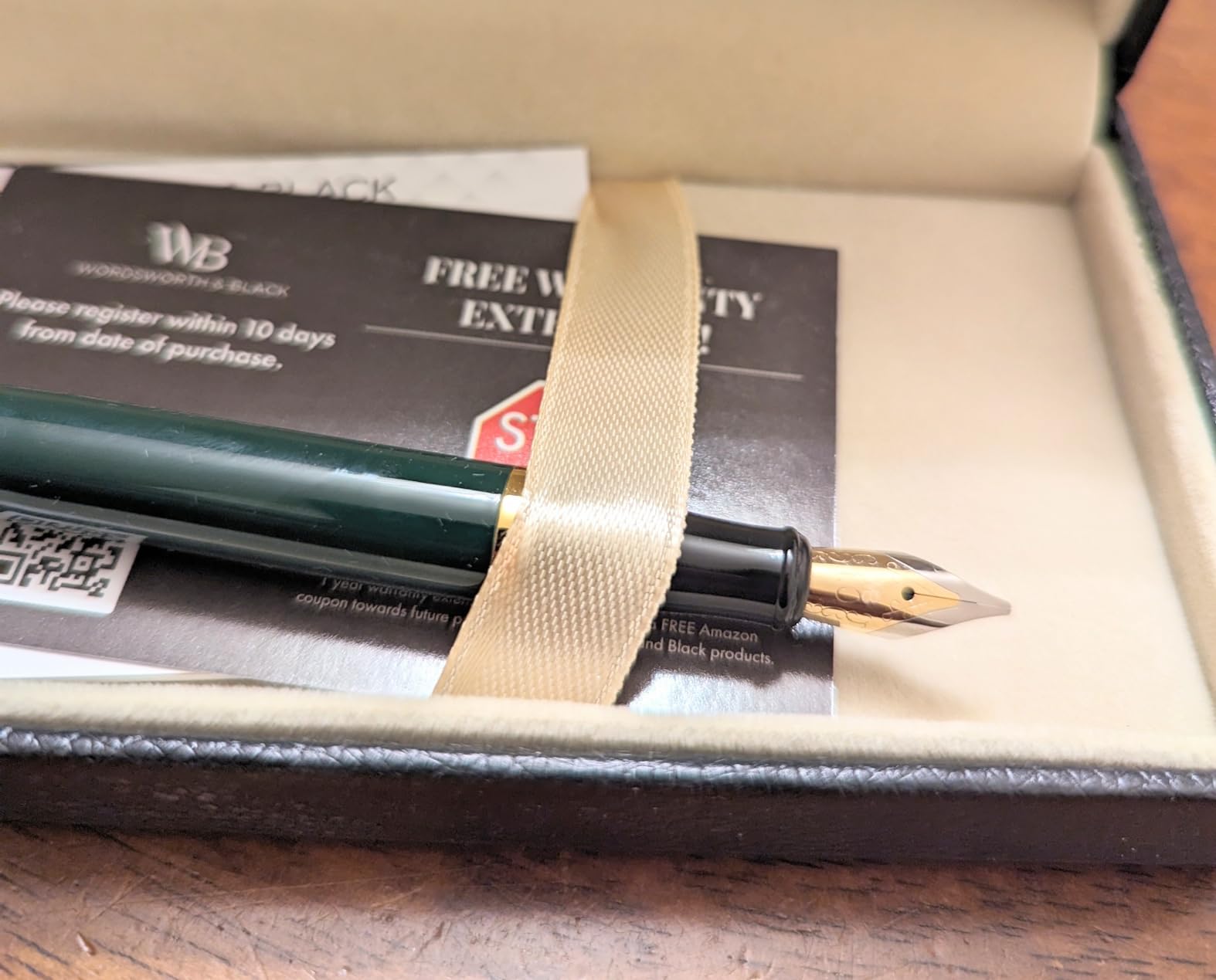
The cap posts with a satisfying click and seals well, and the contoured grip is shaped for a tripod hold. Twenty-four cartridges plus a converter mean you can practise for months before thinking about bottled ink.
It works for both right- and left-handed writers with consistent flow, which is more than we can say for several pens in this roundup.
Best for
Display lettering, invitations and hand lettering where a bolder stroke reads better from a distance. The weight in the hand keeps large letters steady.
If you are practising capitals and headlines rather than fine script, a broad nib is the right teacher.
What to manage
A broad nib consumes ink quickly, so factor refill time into long sessions. Some examples skip at the start of a line or with thicker inks, which is why we prime on scrap paper first.
The gift box is underwhelming for a pen with this much metal in it, but the pen itself is what you will be holding.
12. TIANREN Eight-Nib Calligraphy Set – Best Range of Nib Styles
TIANREN Calligraphy Pen set,Fountain Pens with 8 Different Replaceable Nibs with 60 Ink Cartridges(12 Colors),Calligraphy set for Beginner Writing Drawing.
Eight nibs: EF, bent fude, soft brush, five slanted
60 cartridges in 12 colors
Triangular contoured grip, color coded bodies
Pros
- Widest nib variety in the roundup
- Slanted nibs scratch paper far less
- 60 cartridges including 18 black
- Color coded bodies make nib sizes obvious
Cons
- Cartridges are difficult to install and leak
- Some pens arrive with a crooked nib or heavy flow
- Lightweight build feels inexpensive
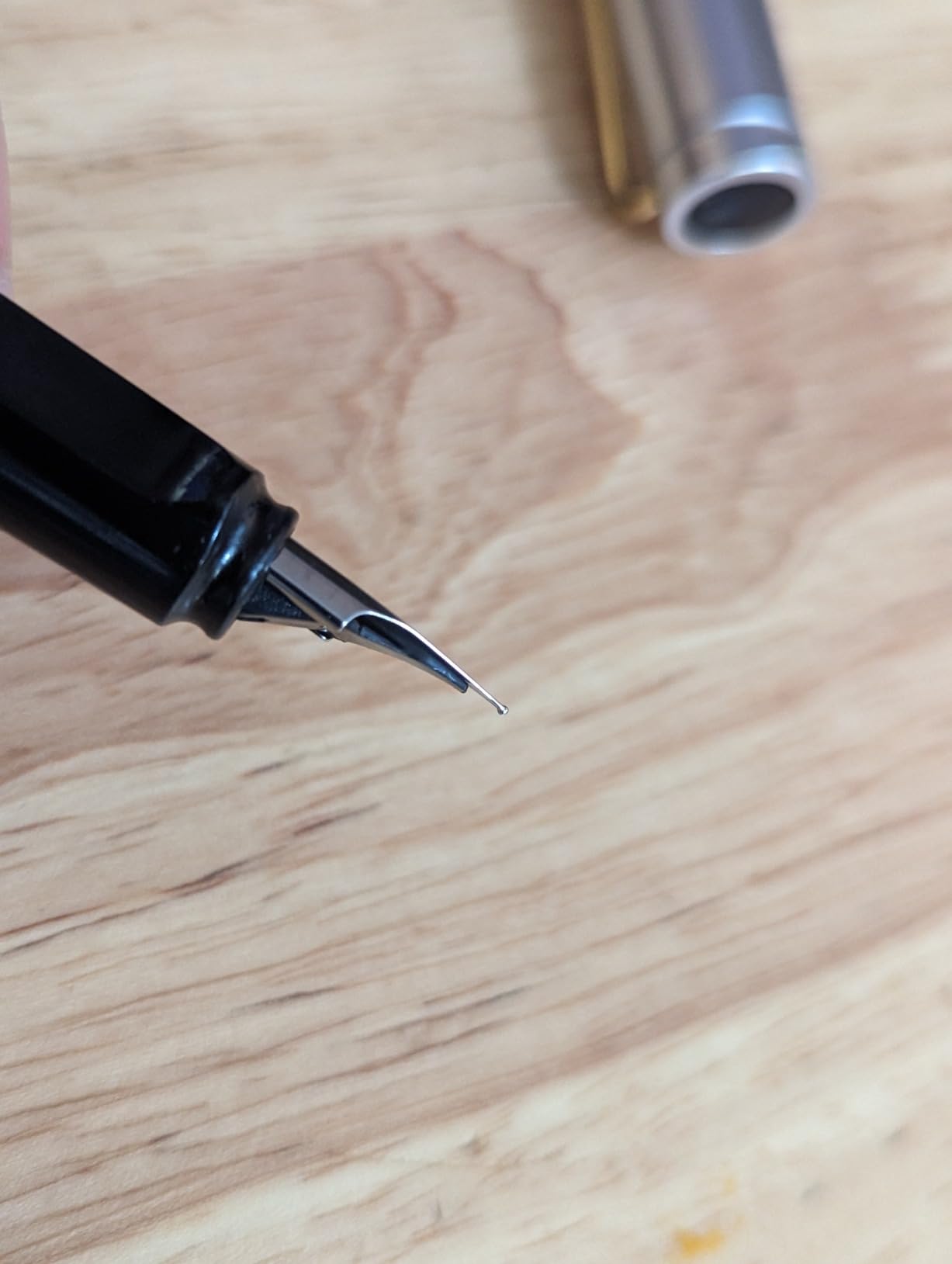
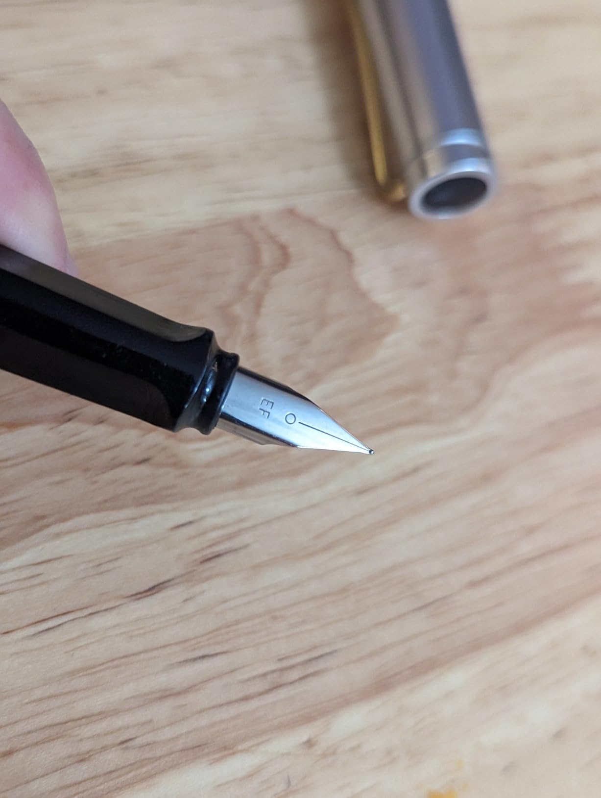
The TIANREN set is the most interesting experiment on this list because its nibs are not all flat broad edges. You get an extra fine, a bent fude, a soft brush and five slanted calligraphy nibs across eight pens.
The slanted nibs are the practical highlight. Tilting the nib edge away from the paper reduces scratching noticeably compared with a flat nib, which solves the complaint we heard most often about stub and italic pens on smooth paper.
Sixty cartridges across twelve colours, eighteen of them black, means colour practice is immediate. Each body is colour coded by nib size, so you stop guessing which pen has the 2.5mm in it.
The triangular streamline grip is shaped to stop finger slipping and sweating during longer sessions.
Who it suits
Curious beginners who want to test pointed-pen feel alongside broad-edge work in the same week. Writers with sensitive hands will appreciate the reduced scratching from the slanted nibs.
Underhand writers are also better served here than with a true flat nib, since the slant works with an angled hand position.
What to watch
Cartridge fitting is the weak point. They are hard to seat and can leak into your hands, so fill over a tablecloth until you have the technique.
This set also has a higher share of one-star reviews than average, mostly for pens arriving with a crooked nib or uncontrolled flow, so test every pen before committing to one.
How to Choose a Fountain Pen for Calligraphy Practice
What type of fountain pen is best for calligraphy?
A fountain pen fitted with a broad flat nib, either a true italic or a stub, is the best starting point for most beginners because the line width changes automatically with the pen angle and needs no pressure control. A bent fude or brush nib suits expressive hand lettering, a flex nib suits pointed-pen scripts, and a standard fine or medium nib produces a monoline that cannot practise calligraphy at all.
What fountain pen nib is best for calligraphy?
For most scripts, the best nib to start with is a stub between 1.1mm and 1.5mm. It is rounded enough to be forgiving of small angle errors, produces genuine thick and thin contrast, and gives you a line thick enough to judge spacing. Move up to a true italic at 1.9mm once your downstrokes are even, and consider flex only when you want Copperplate or Spencerian.
Is stub or italic better for a beginner?
A stub is better for a beginner who wants forgiving practice, because the rounded tip is more tolerant of angle drift and still gives thick and thin contrast. An italic is better once you are chasing crisp, squared-off strokes for formal italic or blackletter, because the flat edge produces sharper contrast at the same angle.
That single distinction is the most useful thing we learned while testing this roundup. Buy the stub to learn control, then graduate to the italic to learn shape.
How the ink system affects your drills
Cartridges get you writing within seconds and keep ink colours consistent, which is what you want when you are learning stroke shapes. Converters cost a few extra minutes and open up bottled ink, including waterproof pigmented inks that do not feather.
Piston and eyedropper fillers hold the most ink and are the least interrupted choice for long practice sessions. Whatever you choose, never put dip pen ink or India ink into a fountain pen. Those inks are formulated for metal nibs and will clog the feed and corrode the parts.
If you are still comparing materials rather than nibs, our roundup of the best titanium pens covers the durable bodies that survive daily practice, and the best tactical pens are useful for pens that need to survive being carried to class.
Paper and ink: what to practise on
Paper decides how your work looks more often than the pen does. Cheap copy paper absorbs water and pulls ink sideways, which is the feathering that makes new fountain pen owners assume their nib is faulty. Smooth coated paper is the opposite problem, since ink sits on top and the nib catches.
Fountain pen friendly paper is sized so the ink sits on the surface and dries fast. Rhodia, Clairefontaine, Tomoe River and Mitsubishi Bank paper are the names that come up repeatedly in the communities we read. For drills, grid or guideline paper matters as much as the paper itself, because you cannot correct slant you cannot see.
On ink, start with a smooth, well-behaved water-based dye ink. A waterproof pigmented black gives you crisp marks that do not feather and will not wash out when you correct a page, which is worth the small extra effort of cleaning your nib afterwards.
Fixing the three problems every beginner hits
Too much ink is the most common complaint, and it has a simple cause: the feed is wetter than your paper can absorb. Widen nibs flood first, so the fix is to test on absorbent paper, slow your speed, and check the feed is seated correctly. If your Parallel floods, this is normal behaviour rather than a defect.
A scratchy stub or italic is usually a nib that has not been broken in or a paper choice issue. Run the nib on scrap paper for a few minutes, use a smoother sheet, and keep the nib clean. Never sand a nib yourself on a pen you want to keep working.
A nib that feels too stiff means pressure is doing the work your angle should be doing. Check you are holding the pen at roughly 55 degrees and rotating rather than squeezing. If lines stay monoline at every angle, the nib is not a calligraphy nib at all.
When to move from a stub nib to flex
Move up when your downstrokes are even at your current width and you want scripts with more dramatic contrast. Copperplate and Spencerian need a nib that opens its tines under pressure, and no stub will get you there no matter how much you practise.
Do not move up early. Flex nibs punish inconsistent pressure with thick and thin line widths you did not intend, which teaches hesitation rather than confidence. Build the foundation on a flat nib first.
If you are still choosing equipment, our guide to the best calligraphy sets for beginners covers the non-fountain options, and our picks for the best luxury pens are worth a look once your technique is solid enough to notice feed differences.
Frequently Asked Questions
Is there a difference between a fountain pen and a calligraphy pen?
A calligraphy pen is a fountain pen fitted with a nib that changes line width with pen angle, such as an italic, stub, fude or flex nib. A standard fountain pen has a fine or medium nib that produces a monoline of constant width, so it cannot create the thick and thin contrast that calligraphy scripts require.
What is the best fountain pen for a complete beginner?
The Pilot Parallel is the most reliable starting point because the flat plate nib produces thick and thin contrast the moment you rotate the pen, with no pressure control required. If you want one pen that grows with you, the Lamy joy set includes three nib widths so you can practise letterforms at three different scales.
Is the Pilot Parallel pen good for calligraphy?
Yes. The Parallel is one of the few affordable pens whose nib is genuinely designed for calligraphy, producing sharp squared strokes on the broad edge and a crisp hairline on the narrow edge. Its one weakness is a generous ink flow, so use fountain pen friendly paper or it will feather and blot.
Which ink should I use for calligraphy practice?
Start with a smooth water-based dye ink that flows evenly and does not feather on your paper. Move to a waterproof pigmented black once your strokes are consistent, because it gives crisp marks and will not wash out. Never use dip pen ink or India ink in a fountain pen, as it clogs the feed and corrodes the metal parts.
Can I add a calligraphy nib to a pen I already own?
Often yes. Many entry-level fountain pens take a standard style nib, and aftermarket stub and italic nibs are made for those fits. Several of the sets in this roundup include nibs that fit common models, which lets you test calligraphy on a pen you already have before buying a dedicated one.
Conclusion: Where to Start Your Calligraphy Practice
Start with the Pilot Parallel. Of the twelve pens we practised with, it delivered genuine thick and thin contrast with the least instruction, the widest range of nib widths to grow into, and the fewest surprises at the refill. Buy the 3.8mm set, pair it with a sheet of fountain pen friendly paper, and drill basic strokes for fifteen minutes a day.
Once your downstrokes are even and you want crisper contrast, move to the Lamy joy set and its three ribbon nibs. If you came to this from hand lettering rather than formal scripts, go straight to a fude nib such as the Sailor and accept the learning curve in exchange for expressive line weight.
Whichever you pick, remember the part nobody sells you. Ten minutes of basic strokes today matters more than the pen you chose this month, and the pen only matters because it lets you keep practising. Our roundup of the best fountain pens for calligraphy practice is a starting point, not a finish line.